Last month, we gave an introduction into how KX Dashboards financial charting component can help technical analysts identify trends in the market. In the second part of our two part blog on technical analysis, we are going to look at how KX Dashboards can integrate the best third party content as a component in dashboards.
ChartIQ For KX Dashboards
ChartIQ is a multi-platform, financial charting application which is easy to customize, while offering a comprehensive suite of technical analysis tools and overlays to help traders time their trades and assess the risk:reward opportunities for their positions.
Streaming Data
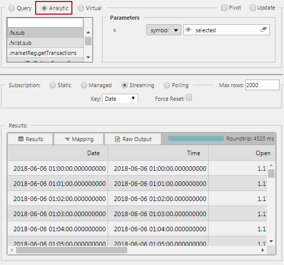
Over the course of our previous posts we have been utilizing queries created in the text editor to populate our components with data but there is an alternative method to get data into the dashboard, and to do this we use Analytics. Analytics are standard q queries created using the KX Control or KX Analytics packages on the KX Platform. Analytic queries expose user inputs to the Dashboard, which in turn can be mapped to view state parameters. More importantly, by using Analytics we can push data direct to the dashboard as a streaming query; this allows us to publish real-time updates such as stock prices or sensor data into our components.
Building a ChartIQ chart
While the ChartIQ component is built using third party content, configuration uses the common format found across dashboard components. A data source – in this case an analytic – is defined as part of a Data Layer. Additional data layers can be added as might be done if comparing different equities within a business sector. The data format is the same as the standard dashboard Financial Chart; using Date, Open, High, Low, Close and Volume data columns. These are automatically parsed by the ChartIQ component without additional configuration. With price data secured, all that is left to do is to set the x-axes and y-axes, although it too is automatically configured.
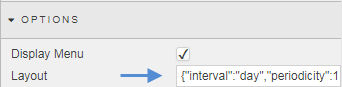
For a more tailored chart, the Options property has a Layout which defines which ChartIQ elements are available to the end user, but the standard layout is already optimized for the user.
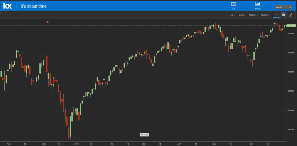
As a basic candlestick chart we have:
Dashboards can now leverage the in-built power of ChartIQ. Let’s look to add some of the technical indicators and overlays available. Remember, what follows should not be construed as investment advice and is only used to demonstrate some of the features of ChartIQ.
Ichimoku Cloud
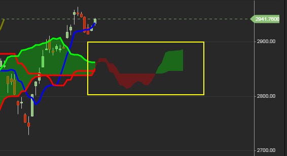
This indicator uses a series of moving averages to determine support and resistance and is plotted alongside a lagged closing price line. The shaded area runs between two lines which is typically offset by 26 days; the first is an average price (of the two other averages on the chart); the second is a line calculated from the average 52-day high and low price – between both is a green or red shaded area dependent on whether the trend is up (green) or down (red). Because of the time offset, the ‘cloud’ projects into the future – offering a guide as to where demand or supply may emerge.
Applying Ichimoku Clouds to our chart gives us:
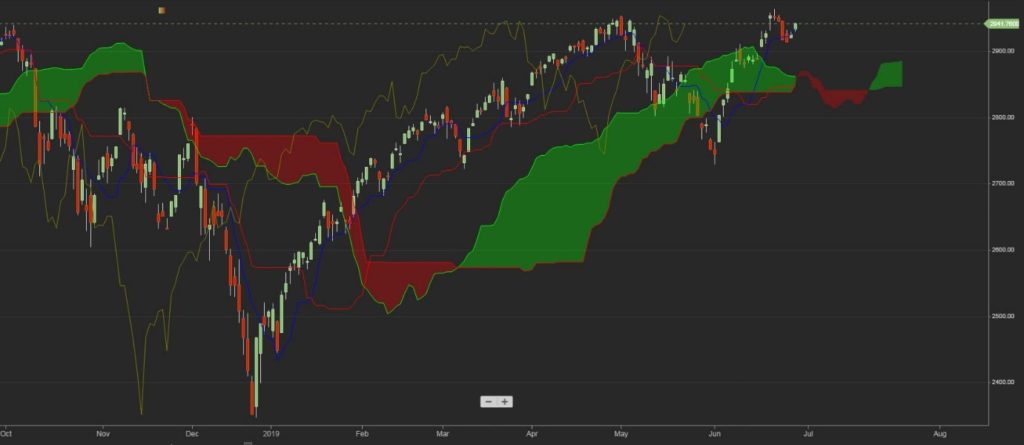
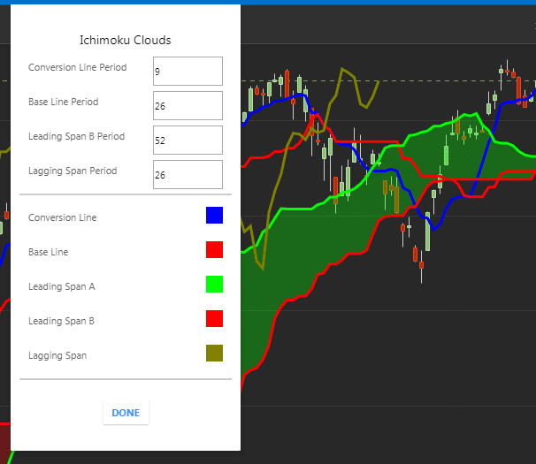
ChartIQ supports user customization of the indicator settings, changing colors in addition to the moving average periods.
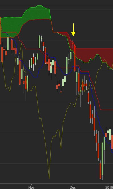
In the chart for the S&P 500 Index (S&P), the latter part of 2018 was notable for prices trading below the cloud zone. The period of overhead supply was illustrated by a small rally in late November which stalled as it entered the red cloud and promptly reversed sharply lower.
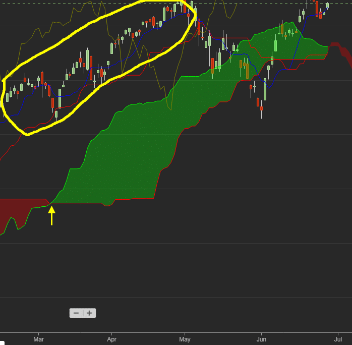
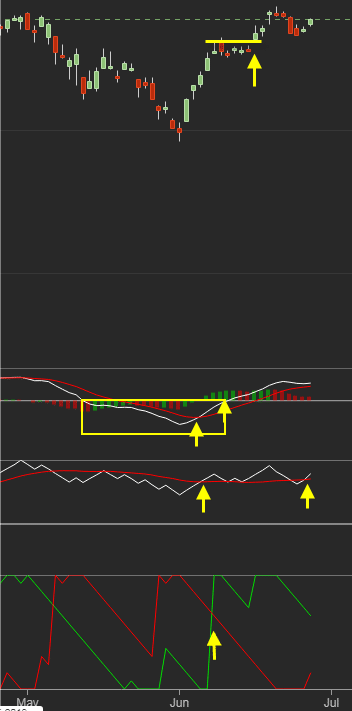
As 2019 rolled in, the S&P had started to find its feet and quickly saw it rally through its red supply cloud and into the airy realms above. In March, we see this relationship shift from one marked by supply (red cloud) to one of demand (green cloud). This demand zone was tested recently in May, and despite a break below this cloud level in May, the S&P was able to quickly recover the loss and return into a challenge of 52-week highs.
Looking at what may happen in the following months, there is suggestion of a possible period of weakness (red cloud) but this should only be temporary. The Ichimoku cloud suggests an area of demand just below 2,900, but the index remains well above this zone.
Technical Studies
ChartIQ also excels in the number of price and volume studies on offer. A typical set up may take a momentum indicator (like a MACD), a volume indicator (such as On-Balance-Volume) and a trend indicator (such as Aroon) to help understand underlying price action.
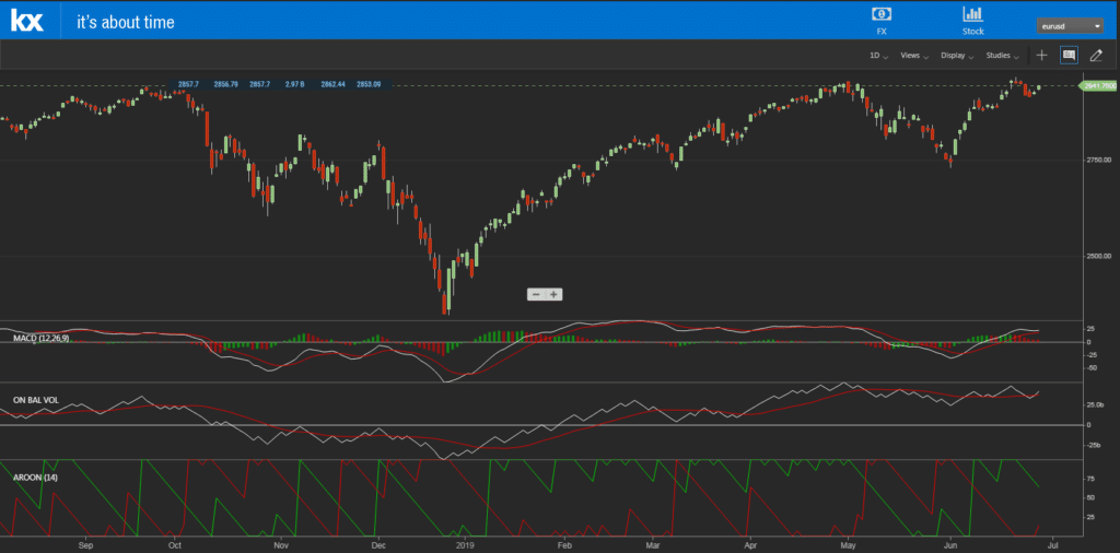
One of the mistakes made by users of technical analysis is applying studies which do a similar thing; for example, using two momentum indicators such as a Stochastic and an RSI. Doing so means events can be missed by not having a more diverse set of overlays.
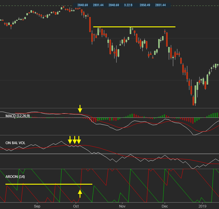
In our example, we can see how difficult it was to use the momentum study, MACD. From August 2018 this indicator had effectively flat-lined, making any signal useless on its own. Of greater practical use was the trend indicator, Aroon, which stayed bullish up until mid-September, when things got a little more erratic.
By October, there was a confluence of bearish signals which marked the end of the 2018 rally. The best came from the Aroon indicator, where the red line marking bearish trend strength broke beyond the past three peaks. This coincided with a failure in On-Balance-Volume, a study which tracks a cumulative total of buying and selling volume – above which is overlaid a 20-day moving average which acts as a divider between heavier buying (above the line) or selling (below the line); here, the trend in buying fails to make it above its 20-day moving average, suggesting a lack of buyers willing to get involved. The MACD had begun its acceleration lower at the same time but given the prior lackluster action in this indicator, it would have been a signal ignored if studied in isolation.
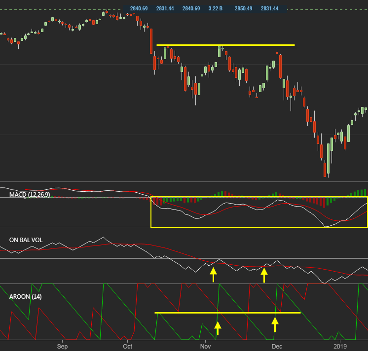
By November 2018, the indicators shift in importance.
Now the MACD is trading well below its mid-line in the area where a momentum indicator is considered “oversold”. An “oversold” indicator is self-explanatory in that it marks an area where there are more sellers than buyers. We can use the MACD to filter some of the more confusing signals found in our Aroon and On-Balance-Volume studies.
If we look at the start of November and December, we can see On-Balance-Volume made two attempts to cross the trigger line but each failed. Aroon was also looking to signal a new trend, but got whipped back before a bullish trend could establish. The other marker we can look at is price. In early October there was little price peak around 2,800 which held as resistance in November and again in December. For a new bullish trend to establish, the prior price peak must be broken, and in each case here it failed to do so. When considering which signals or actions are the most important, price action will always be your number one.
With the advent of the new year and 2019, there was a shift in the outlook for the S&P. We still had several bearish hurdles to clear but each of these were done by mid-January.
First off is the big end-of-year reversal with that massive green ‘candlestick’. This is not a clear signal to start buying but it gives an indication for better times ahead. In the early days of 2019 we have three ‘buy’ signals across our studies in close proximity to one another. We had something similar in November and December 2018 which turned out to be false signals but it’s reason to be alert. What keeps a lid on the buying is the still ‘oversold’ nature of the MACD. However, there is a point of optimism when price breaks the little mini-peak established on the first trading day of 2019. As prices continue to advance we eventually get to see the MACD move out of its ‘oversold’ condition and into an ‘overbought’ zone where buyers exceed sellers.
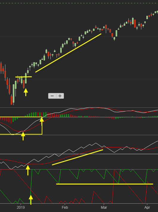
At this point, the buying becomes self-fulfilling. We see a rising trend in On-Balance-Volume in support of the rising trend in price, and the Aroon green line is running well above the red-line. People waiting on the sidelines to participate in the rally see prices rise, the more motivated they become to buy. This condition remained true until May but another set up similar to January 2019 may be in the making now.
What happens next remains to be seen…


