The latest version of KX Dashboards Direct 1.1 is now released and free for 5 users, with Platform 4.5.1 available available to download for Enterprise users. Dashboards offer a fast, accessible way to visualize your data, with no programming knowledge required. KX Dashboards is a dynamic product, constantly evolving in both performance and functionality to help meet the demands of a changing world. Our latest release is no exception as KX Dashboards leverages the benefits of kdb+ technology with the integration of hardware acceleration to render millions of data points in a single chart with minimal performance impairment. This is critical for sectors like financial services where millisecond delays in the acquisition, processing and execution of trade orders can lead to millions in lost revenue. As part of the release we have also made Dashboards easier to use with a new Template Editor and a visual query Builder. Template Editor allows users to format tooltips, column data and text elements using a traditional text editor. While Builder is for users with little or no kdb+ experience and is the fastest way to get data into your dashboard.
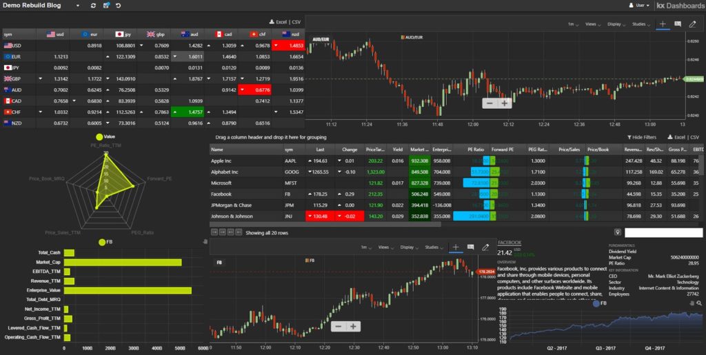
KX Dashboards comes with a suite of sample demo dashboards which reference many of the features and functionality on offer to users. In this blog we will reconstruct one of the demo dashboards, Demo Stream, to give readers a taste as to what’s available to trial for free.

We can start by downloading a copy of KX Dashboards.
As a starting point we will take a tick-based, data streaming service and display the output in a couple of different components. We will start by using a core component of KX Dashboards, Data Grid. The data source we are using is a Streaming service of currency pairs, configured as a cross-reference watchlist. Our watchlist contains columns of price which will share format properties. To apply shared formats we can use Data Grid’s Multi-column Editor . In addition to standardizing our column properties like width, we can include built-in highlight rules to mark changes in our tick data. As a finishing touch, we can use a Template Editor (more on this later) and CSS to add a little more color to our watchlist with national flag icons representing the different currency pairs
The watchlist of currency pairs gives us a snapshot of current action, but to add context we would like to have a price chart of a selected currency pair. KX Dashboards offers two financial charting tools to render price data; a built-in Financial Chart and ChartIQ (now Cosaic). ChartIQ is a third party financial charting service available under license. We will use ChartIQ to plot our price data constructed from our tick data service and create an interaction so when we click a currency pair in the watchlist a price chart is created for the selected FX pair.
In our Data Grid we use Selection and Routing to map the currency pair to a view state parameter. A second Streaming tick service builds the chart. ChartIQ automatically renders our price chart without further input from ourselves, so all we have to do is some minor configuration – such as enabling the user menu bar for the chart. We can always check we have configured everything correctly by going into Preview mode and testing the interactions.
We now have a start on our dashboard, but we can continue by adding equity data and using a range of components to display the data. The primary component will be a Data Grid of fundamental data. Radar and Canvas Charts will be used to visualize company fundamentals. Fundamental descriptors typically have names ill-suited for use in a traditional x-axis, so we are going to use the Transpose option in Canvas Chart to make our bar chart horizontal. As we had one with our FX currency pairs, we also need a view state parameter for our stock symbol to determine which asset is currently selected.
For our Data Grid we use the Builder to create a linkage between two separate data sources; one of equity streaming prices and another with the static data for our fundamentals. The Join step merges the datasets using the shared sym variable.
With our data source defined, we can then apply formats to style the grid; including range highlights, column templates and in-grid bars to help with cross comparisons between equities. The video demonstrates some of this functionality, including:
- Drag-and-drop reorganization of column order
- Multi-select formatting of column widths
- Real-time highlights to live price bar and price change
- Smart Number formatting for large value columns
- Use of Header Tooltips
- Apply font color to column values using Basic Template
- Range highlight
- Left-to-Right and Right-to-Left Highlight rule bars.
- Cut-and-paste of Highlight rules
- Custom Column sort.
As we had with the FX Watchlist, we can create a Selection & Routing behaviour to map selection of the equity symbol column from the Data Grid to the symbol view state parameter used by the Radar and Canvas Chart. We can then add a second ChartIQ to our dashboard for our streaming equity price chart which updates on selection as we had done with FX prices.
Our fundamental equity data includes descriptive elements which don’t display well in a standard data grid. To display this type of data, dashboards offer a Text component. We can take string data, such as a company overview, and with the Template Editor apply formatting for legibility. Template Editor has an Advanced and Basic mode. With Advanced mode we can use HTML table formats and handlebar helpers to build highly customizable data displays. Then apply CSS to style these elements.
Basic mode of Template Editor offers flexibility in a fast, accessible form. All data from your data source, and dashboard view states can be displayed with the text editor to style the output. For example, our last component is a simple line Canvas Chart of closing price, but we have used the Basic Template Editor of the tooltip overlay to add Open, High, Low and Closing price; with a bold weight to the Date header and color formats for High and Low price.
As you can see, KX Dashboards offers a huge range of options to help visualize your data. Streaming data can be shared with historic data in a single component. Interactions using view state parameters allow information to pass between components. A built-in Template Editor allows users of all abilities to fine tune how their data can be displayed. If you are looking for more, head over to our documentation section, grab yourself a copy of KX Dashboards, watch some video tutorials and start visualizing with KX.


