By Declan Fallon
4:25pm Back in the Saddle
In our last post we managed to build a color-coded, summary table which we can use in our end-of-day report. However, KX Dashboards offers components which can help us investigate our data.
For this, we will use a Pivot Grid. But before we do, we can give ourselves some more space by creating a new blank screen.
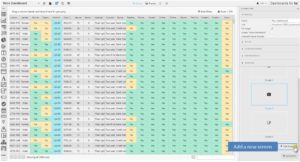
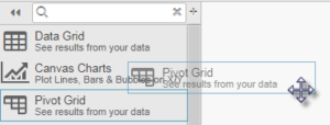
With our blank screen, we can then add our Pivot Grid using the same click-and-drag process we used for Data Grid in our initial dashboard screen.
Next, as we did for the Data Grid, we add a Data Source. We are going to use the q-language query to run the pivot query as we need to define our independent and dependent variables to group our data.

In the data editor is a check box to enable a pivot query; if we don’t do this the pivot options will remain hidden. This will add elements we need to define our pivot query. The independent variables are assigned to Breakdown Cols., and the dependent variables are given to Aggregates. Each Aggregate uses a simple calculation for each data grouping; in this example, we want to know the average monthly and total charge, along with the length of the account (‘tenure’) for each category group.
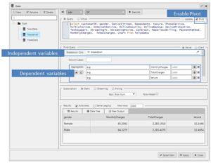
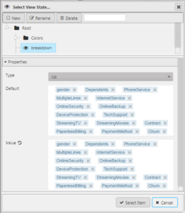
For the Breakdown Cols, we introduce another view state parameter called “breakdown”. The “breakdown” view state parameter lists all of our available independent variables. These will be the categories which our customer charges and tenure will be calculated against.
4:30pm Add a Navigation Level
With our Pivot Grid in place, we can next look to include a navigation control. The Breadcrumb component offers us the ability to jump in-and-out of an investigation at any point along the chain of categories used by our pivot query. Add this component to the dashboard.

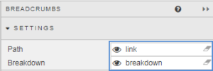
The Breadcrumb component just offers two configuration elements: First, we assign our “breakdown” view state used in our pivot query to the Breakdown setting of the Breadcrumb; this pairing ensures both components share the same navigation choices. Second we have to assign a new view state parameter, called “link”, to the Path setting.
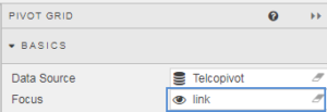
Where links are established between components a view state parameter can be used to share information states between them. So where Path is the share setting for Breadcrumb
Focus is used by the Pivot Grid.
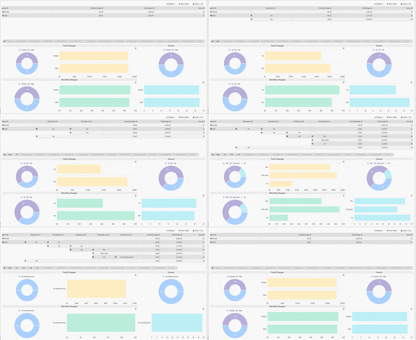
With some minor formatting of the numeric formats of the pivot data we are left with:

But now we need some color.
4:32pm Give me some charts!
Our independent data is a series of ‘yes’, ‘no’ responses with the occasional detail, such as payment type or internet service. Our dependent data is monthly and total charges by customer and how long they have had an account with the company. One of the easiest ways to digest this data is to use a Pie Chart. With a pie chart one can quickly see which response is dominant.
For a bit of extra flavour, we will also include a horizontal chart built using Canvas Chart. Dashboards for KX uses the single component Canvas Chart, to create a number of chart types – including line, bar, bubble, boxplot and financial candlestick charts.
For our visuals we are going to create three data groupings: Total Charts, Monthly Charges and Tenure (length of service).
4:33pm Total Charges
We want to build an association between our Pie Chart and our horizontal bar Canvas Chart. To do this, we will create a header bar using the Text Component which will cover both charts.
The Text Component is relatively straight forward to configure. First, we can add the title “Total Charges” using the built-in text editor
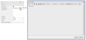
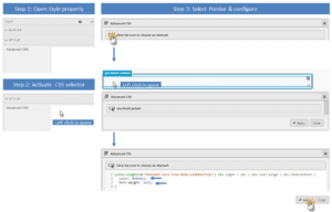
We could format the text from the editor but we get more control using CSS. This is done from the Style menu in the Text component property panel. We will set the font of the title to use a grey (#666666) and make it bold.
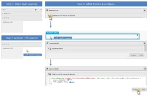
Next, we will add the first of our charts. Bring a Pie Chart into your dashboard

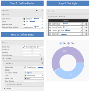
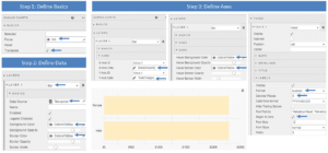
We configure the pie chart with data from our pivot query. Our Data Source remains unchanged. As we want to link the actions of our Pie Chart to the Pivot Grid and Breadcrumb component we set the Focus property to use the linking view state, link. The Selected Value Attribute and Series Key are mapped to the {breakdownID} as the labels will have to reflect the pivot query results.
Data is configured by adding layers. This is a single layer data chart and we map it to TotalCharges from our data.
To add a little color we will configure the Color Palette to use the colors we assigned to view states from our initial Data Grid. There is a check box we have to set so our pie chart uses the color palette.
Next, we will add a complementary horizontal bar chart using Canvas Chart. Again, similar steps used for our Pie Chart are applied when configuring the Canvas Chart. We ensure we have the linking view state assigned to the Focus property under Basics. The horizontal bar chart is defined by the Transpose property used in conjunction with the bar chart selection in the Layer dropdown menu. The data layer sets the data source (our pivot query). We use our predefined color view state parameters for setting our bar (and hover over) bar colors. The x-axis uses the dynamic {breakdownID} defined by the pivot query. The fine tuning of the y-axis is done by formatting the data and adding a “S” prefix.
Taken together, our Total Charges section of our dashboard now looks like:

4:38pm Monthly Charges and Tenure
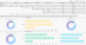
We can apply the same formats to set up the visualizations for Monthly Charges and Tenure. Changing will be the Y-axis Data and the bar colors of the Canvas Chart and Series Data of the Pie Chart.
With our three data points visualized we are left with a dashboard looking like this:
4:43pm Investigate
With the visuals in place and component links defined, investigators can drill into the data to see what’s happening with their customer base.
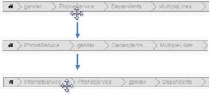
With the Breakdown component, different categories can be repositioned in the chain
With time to go to our deadline we can see:
- Gender is not a factor in total spend
- Men and Women with dependents spend less a month but more in total as they are more likely to be long standing customers
- Fibre Optic customers have the highest monthly charge of $91 a month compared to customers with no internet service who average just $21 a month – both groups having phone service.
- Customer’s paying the least are also the least loyal, with tenure’s less than half of their most loyal customers
- The most loyal customers with the longest tenure are those paying for all services and use paperless billing. Their typical monthly payment is $115 a month with total charges of over $8,000
- The least loyal customer only uses a phone service and has a total charge of just $665.
