By Declan Fallon
KX provides a broad list of products and solutions built on the time-series database platform kdb+ that capitalize on its high-performance capabilities when analyzing and visualizing very large datasets. KX Dashboards is the visualization component of the solution that enables technical and non-technical users to query, transform and present data in a familiar and friendly format. In this series we explain some of the functionality of KX Dashboards and provide some insights into how it can be used in developing business solutions. In our first entry we explain how they would help you if asked for a new end-of-day report at 4:00 PM! Read more below and check back to the KX blog for more articles in this series.
The last 10 years has seen a sharp rise in the number of data visualization solution providers. KX Dashboards sets itself apart from its peers by melding rich visuals with the power of KX technology. Dashboards is easily accessible, using a familiar drag-and-drop build process in a WYSIWYG interface. With over thirty built-in components covering charts, data tables and user input options, users can have their first dashboards running in minutes. No programming experience is required and dashboards run seamlessly across all modern browsers on mobile and desktop platforms. So why wait, KX Dashboards is here for you!
A picture is worth an end-of-day report, requested at 4pm.
It’s easier to see what’s happening in your data than to try and read about it. In this post we will create a simple dashboard using an open source Telcom Customer Churn1 data set. In later posts we will look to optimize the dashboard to better answer questions different users may have of the data, but first we will cover the basics.
4:01pm: Where to start?
First, get your data into a KX database available as a free download on the KX website. KX Dashboards is part of the KX suite of technology which includes Control for KX and KX Analyst.
The dashboards interface has three main elements; a left panel with a list of component widget, a large central space where we create our dashboards and a panel on the right which has the configuration options for each component. A header menu contains menu options to save and create a new dashboard. With KX Dashboards running we will start with a new blank dashboard and then create a data connection to tell Dashboards where our data is stored.
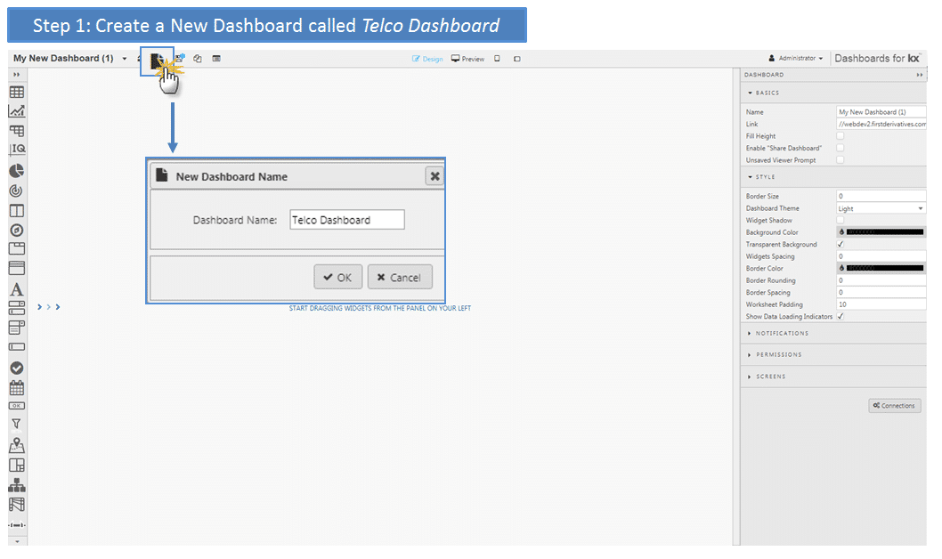
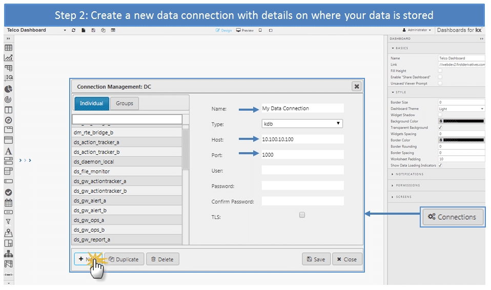
A newly created data connection will have a name (listed in available connections), host address (e.g. IP address) and port reference for your Kx database. Save when done. Multiple databases can be grouped together as a single connection but this isn’t necessary for our example. When building a data query, available databases will be listed from a dropdown menu in the data editor
4.02pm: Add a component
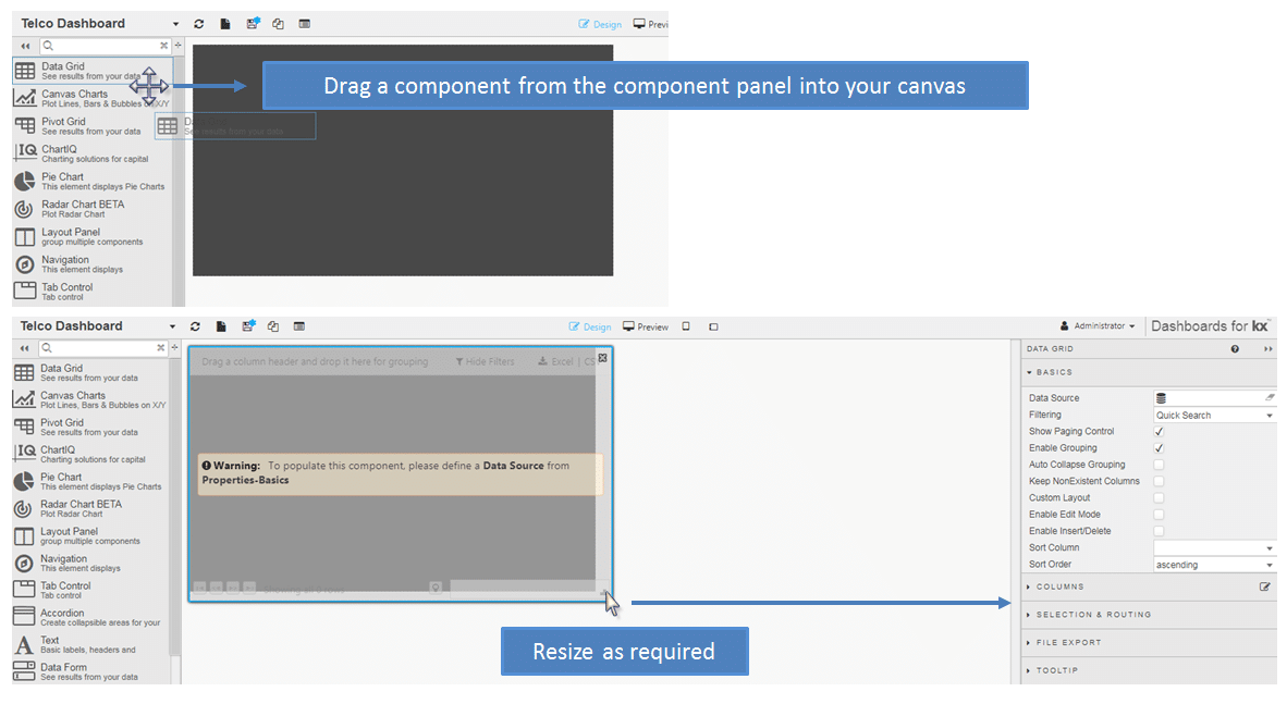
The panel on the left has a list of available components with the most commonly used at the top. This panel can be slid out to show the list of component names until the icons become familiar to you. The first component to use will be the Data Grid. Left-click-and-drag the data grid into the central workspace, then use the bottom right drag zone to resize to fill the width of the workspace. When a component is selected it will have a blue border highlight and the panel on the right will update to show the properties of the selected component.
4:03pm: Give me Data!
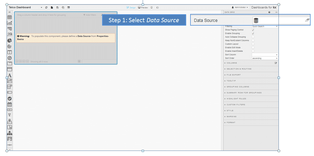
Next it’s time to populate the data grid with data. Again, dashboards are organised so the more important elements are easily accessed. In this case, we need to create a Data Source. A data source is a query built using an analytic, directly with the q language or a virtual query.
Click-select inside the Data Source input box to open the data editor. The data editor will be blank when it’s first loaded, so a new data query will need to be created, called “Telco Data”.
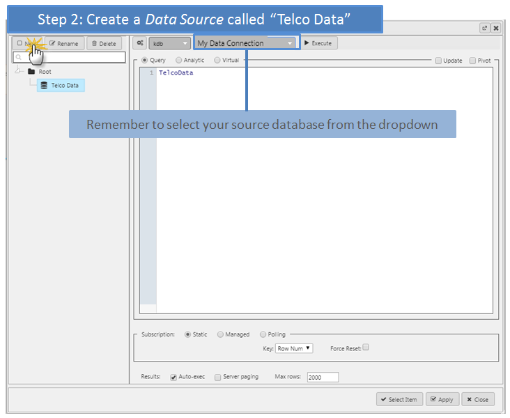
The data editor will list all available queries in the left panel under the Root directory. Selecting a query will populate the right panel with the query details. The larger dropdown above the right-hand-panel has a list of all available KX databases. Here, we need to select the database (“My Data Connection”) which has our data.
The body of the data editor is where an analytic is selected or query built. As this is a very simple data call we will pull all available data without any optimization as could be achieved using q language (see highlight box for an example q statement for the data) or an analytic. The data in our database is stored under the name TelcoData (case sensitive) and this is the basis of our Query in the editor input panel.

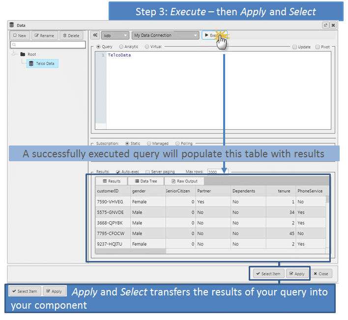
Next, Execute the query; a successful execution will populate the Results panel with the data. At this point, to get it into our dashboard we have to Apply, then Select.
4:04pm: Format our Table
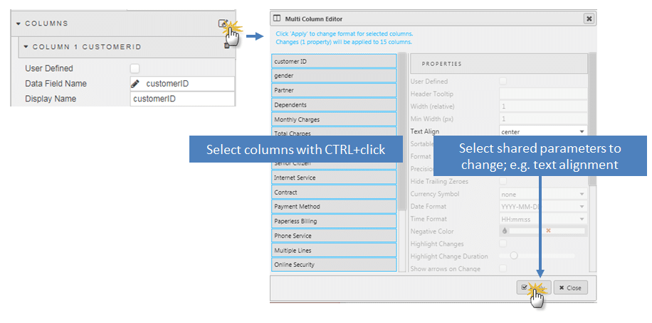
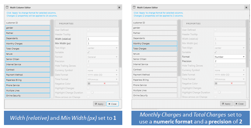
With the data in place we can start formatting the values in the Data Grid. There is a fast-track way of making updates to columns and that’s with the multi-column editor. Here are examples for centring columns, changing column widths and applying data formats.
Our data has a number of columns with “Yes” or “No” values. Here, we can use Highlight Rules to color code the values in the grid. Highlight rules have a target column – the column changed by the rule – and a condition column – the column controlling if the rule is true or false. Colors can be selected from the palette. A separate rule is required for each statement and each column of Yes/No values will have a two highlight rules; one for when the condition value is a Yes and one for a No.
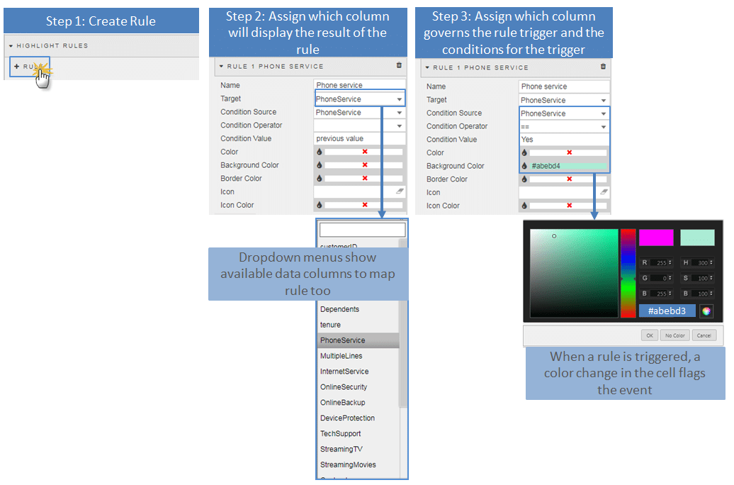
4:05pm: Fine Tune Table
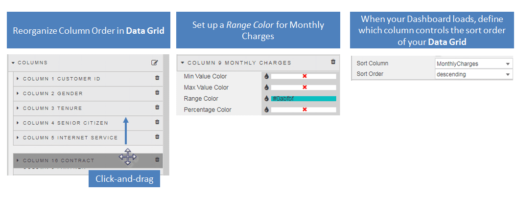
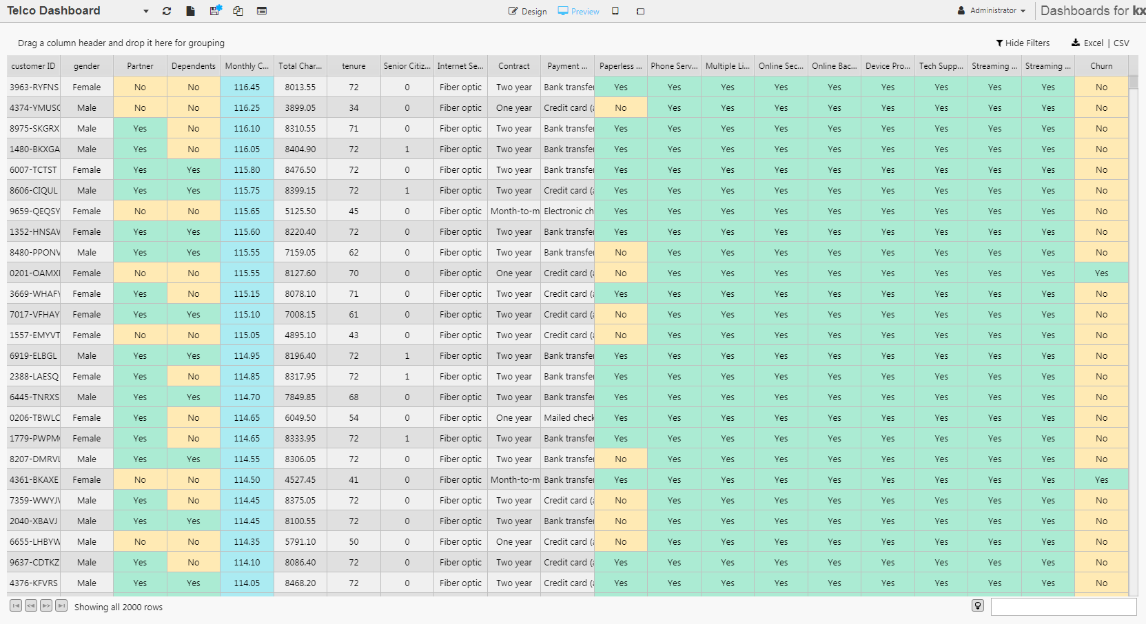
Using a series of Highlight Rules for each column of Yes and No values, a re-order of the columns, adding a Range color of Light Blue to columns with numeric ranges and a column sort
We have a Data Grid looking like this:
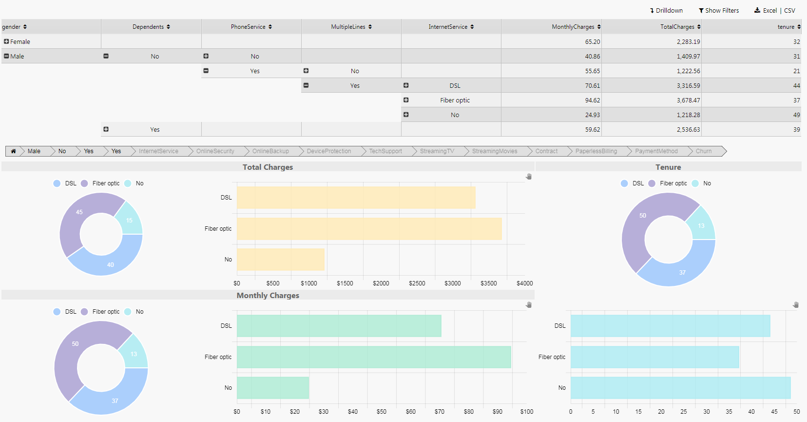
4:10pm: Take a Coffee Break… Part II, Adding Visuals next post
1: https://www.kaggle.com/blastchar/telco-customer-churn#WA_Fn-UseC_-Telco-Customer-Churn.csv


